
Giving a Desk Sensor a Clear Visual Identity with Seedream 6.0
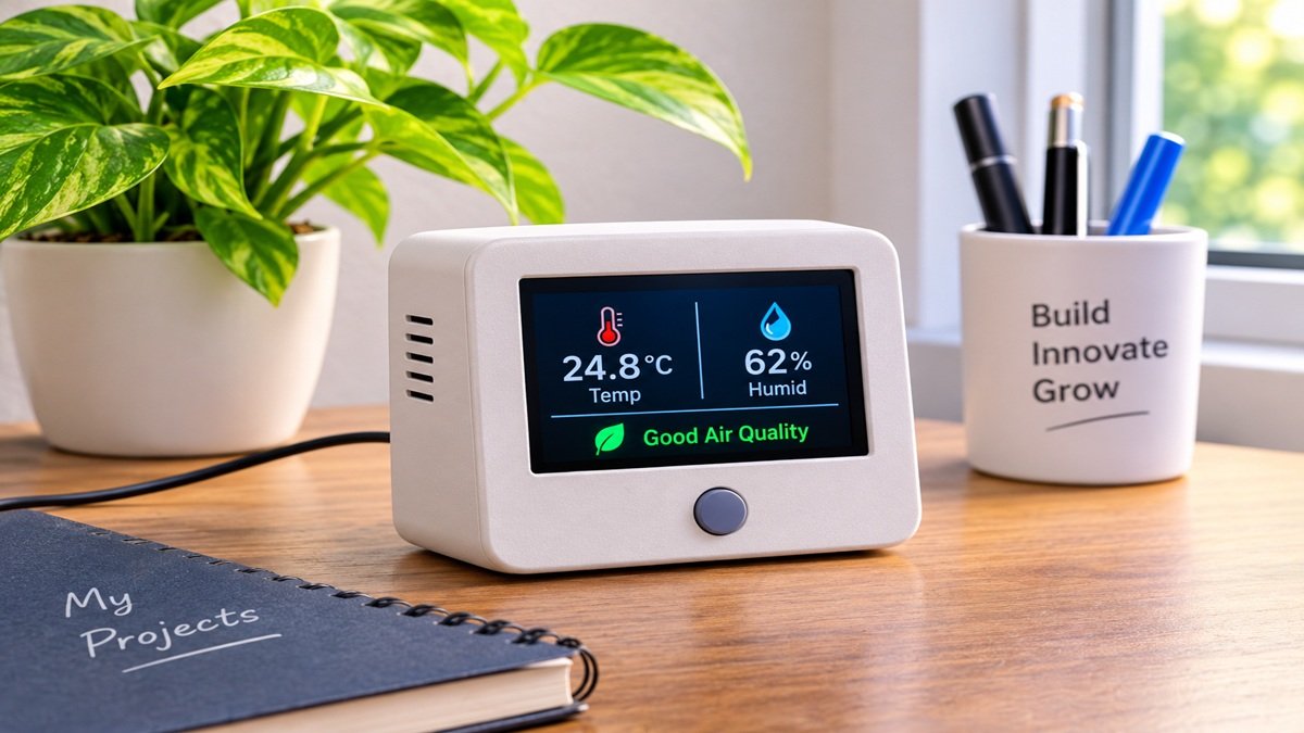
A small environmental sensor can be difficult to explain in a project photograph. The enclosure looks like a plain box, the most useful part of the display catches a reflection, and the cable draws more attention than the device. For a proposed maker project, I would develop a set of concept images showing how a compact desk sensor might fit beside a notebook and a houseplant. These would be design illustrations, with actual build photographs reserved for documenting real hardware.
The device in this exercise would have a simple rectangular case, a small display area, and one visible button. Before thinking about dramatic lighting, I would decide which face needs to be seen and why. Readers should understand the intended scale and orientation immediately. An attractive render that hides the display or suggests impossible construction would not help someone follow the project.
Start with the enclosure, not the circuitry
I would draw a rough front and side view of the proposed case, including the position of the display and the cable exit. Those sketches would express the concept without pretending to be manufacturing drawings. Any dimensions, ventilation requirements, or component choices would need to come from the actual hardware design. The image brief would concern appearance and placement, leaving engineering decisions to the appropriate tools and measurements.
A first visual study in Seedream 6.0 could turn that modest brief into a desk scene: a matte off-white enclosure, a dark inset screen, a single round button, and soft daylight from the side. Its image-generation and editing capabilities are useful for exploring the presentation of the concept. I would not treat the output as a wiring diagram, a working interface, or evidence that the sensor has been built.
The first Seedream 6.0 picture would use a three-quarter view, low enough to show the front clearly but high enough to reveal the top surface. I would leave room around the device so a later crop does not cut off the cable. A plain notebook nearby could suggest scale without adding a hand, which might distract from the enclosure and introduce another object that needs careful review.
Make the display quiet and readable
A generated screen full of precise numbers would create more problems than it solves at this stage. I would request a simple dark display area with restrained graphic blocks, then add any explanatory labels separately in the presentation file. If the final project has a real interface, a verified screenshot or photograph would be the source for its exact values and wording.
For Seedream 6.0, I would describe the screen as recessed slightly into the front face, with a narrow border and minimal reflection. That gives the image a clear physical relationship between case and display. I would inspect the corners, the border thickness, and the button alignment before worrying about a more elaborate desk background.
Suppose the first result stretches the display around the side of the box. My revision would keep the enclosure angle and move the display entirely onto the front panel. I would name the intended boundary rather than ask the model to improve the design. A focused edit makes it easier to judge whether the specific problem has been corrected.
Try a material change without changing the whole object
Once the proportions look useful, I would explore two case finishes. One would be matte off-white, suitable for a quiet desk. The other would be a muted blue that separates the device from a pale wall. I would keep the lighting, camera angle, and nearby notebook as similar as possible so the comparison remains about the enclosure finish.
Bringing the selected image back into Seedream 6.0 would let me request that color change while describing the elements to preserve. I would compare the results side by side, because even a narrow edit can alter small details. If the button moves or the screen grows, the new version would need another correction before it becomes a useful alternative.
The material language would stay specific. A slightly textured plastic surface should respond differently from polished metal, and a shiny case could make the screen harder to distinguish. I would choose the finish that lets the important shapes remain clear. The objective is a plausible concept image for discussion, not a promise about how a particular printing material will look after fabrication.
Let the setting explain the intended use
The desk scene would include only a few supporting objects. A closed notebook and a small plant would suggest an everyday workspace, while a window edge would explain the direction of the light. I would avoid adding a laptop full of invented graphs. The sensor should be the subject, and the surrounding objects should help explain its intended place rather than compete with it.
My next Seedream 6.0 revision would address the cable if it crossed the front of the case. I would route it visually toward the back edge of the desk, keeping its connection point visible. This is a composition choice for the illustration. The actual connector position and safe cable routing would still depend on the physical design.
A second image could show the device on a shelf, viewed straight on. That would reveal whether the concept remains readable against a different background. I would not need a dozen environments. Two carefully chosen settings could expose the main presentation problems: insufficient contrast, an unclear display, or a shape that looks awkward when the viewing angle changes.
Keep the project page honest and useful
When assembling the project page, I would label these images as concept illustrations and place them beside real sketches or build photographs when those exist. A reader should be able to distinguish what has been imagined from what has been constructed. The generated scene can communicate an intention, while the build documentation explains how the real device works.
I would review every Seedream 6.0 image for details that could imply unsupported functionality. An extra port, a second button, or a colored status light might look convincing but change what the reader believes the device can do. If those features are not part of the intended design, I would remove them from the image or choose a simpler view.
The final export would be sized for the page where it will appear, with a separate thumbnail crop that preserves the screen and button. I would add captions and technical labels in an editable document rather than bake them into the illustration. This keeps later corrections manageable when the enclosure design changes or a real prototype replaces the concept.
Seedream 6.0 would be most valuable here as a way to make the visual idea easier to discuss: a small object, a readable face, a sensible setting, and a few deliberate revisions. I would consider the exercise complete when a reader can understand the intended form of the desk sensor at a glance, while still seeing clearly that its engineering and performance belong to the real build.


